
Turn a Company Logo Into a Custom Emoji Without Ruining It
A logo designed for a website header rarely survives at chat size unchanged. Use the simplest approved mark, crop it tightly, preserve its proportions, and test it in a real message before the workspace adopts it.

Miles Crawford
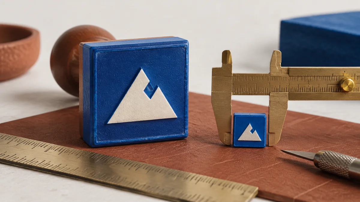
Start With the Approved Brand Asset
Ask for the official icon, symbol, or compact logo from the brand kit. Do not screenshot the website header or pull a tiny image from a search result. The full horizontal wordmark is usually a poor emoji because the letters become unreadable. A standalone symbol or short monogram is the better starting point when the brand allows it.
Keep the original file untouched. Work on a copy so the team can trace the emoji back to the approved asset and replace it cleanly after a rebrand.
Never Stretch the Logo to Fill the Square
Put the mark on a square canvas and scale it proportionally. Crop empty canvas, not the logo itself. If the mark is naturally wide, leave balanced transparent space above and below rather than squeezing it into a square. If it is tall, keep equal space on the sides.
The goal is not to fill every pixel. It is to make the defining shape as large as possible without distorting proportions, clipping protected clear space, or making the mark feel cramped.
Make Transparency and Color Deliberate
Transparent PNG is usually the safest static format. Remove an accidental white rectangle behind the mark, but keep any intentional badge or container that belongs to the identity. Do not recolor the logo just to improve contrast unless the brand kit already provides light and dark variants.
Test the approved light and dark variants against both chat themes. If neither works on both, keep two clearly named files such as :acme_light: and :acme_dark: rather than inventing an unapproved outline.
Preview the Actual Workflow
Open the Teamsmoji Emoji Maker, drop in the approved image, crop the canvas, and inspect the chat-size preview. The maker runs locally in the browser, so the source image does not need to leave the device.
Export one clean master for the intended platforms, then use the cross-platform preparation guide for shared file targets. If the logo looks soft, fix the source and crop before adding compression.
Run a Five-Point Brand Check
- The source came from the current approved brand kit.
- The logo keeps its original proportions and clear-space rules.
- Colors match an approved light or dark variant.
- The defining shape remains recognizable at chat size.
- The shortcode is short, obvious, and tied to the company name.
Finally, upload it to a small test workspace and place it next to ordinary text and reactions. Approval at full size is not enough; the final product is the tiny version coworkers will actually see.